Information at a Glance: Do Your Charts Suck?
How Pre-attentive Processing, Gestalt Theory, and Visual Data Encoding Inform Data Design Decisions

Let’s face it: that report you worked on — nobody’s actually going to read it.
In the best-case scenario, people might skim through it, pausing briefly under the allure of a brightly-coloured diagram.
But if you’ve designed your diagrams properly, a brief glance is all someone should need to understand what the data is saying — at least at a high level.
The ability to quickly convey information is what sets an average graph apart from a great one. Let’s take a look at some techniques from psychology that we can use to make our diagrams easier to interpret.
Pre-attentive Features
Pre-attentive features are the design elements of a chart that can be perceived without directly paying attention to them.
They’re features that immediately grab our attention when we first look at something.
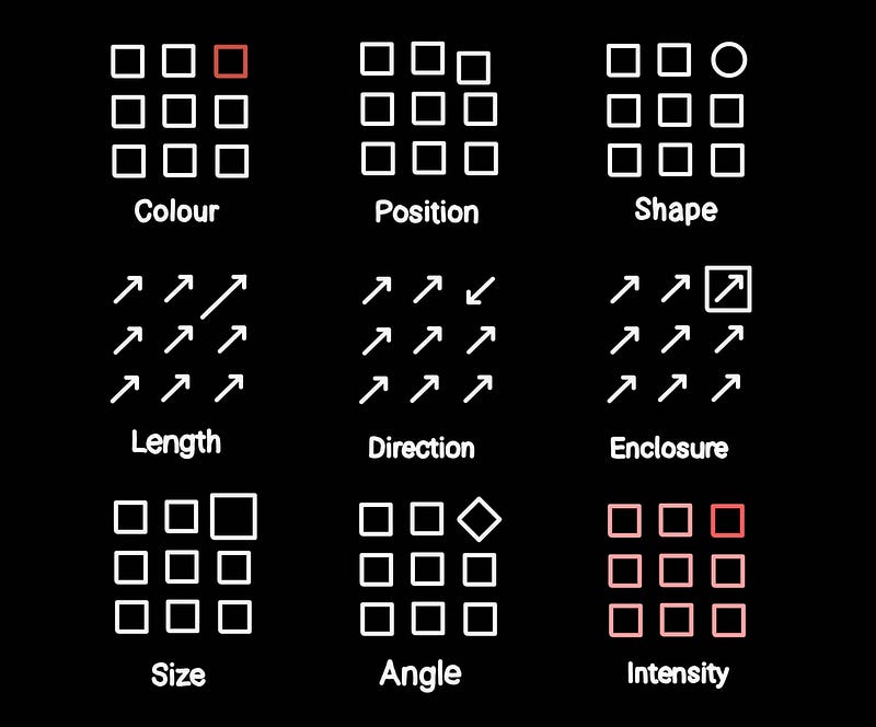
Our eyes are naturally drawn to these features, making them quick to identify. As such, they can be useful for directing a viewer’s attention to where we want it to go.
Consider this example — how many 2s are in this grid of numbers?
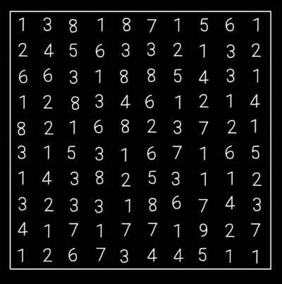
How about now?
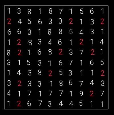
With the additional highlighting, it’s much quicker to identify the twos. Instead of scanning line-by-line, our eyes quickly jump between the highlighted numbers.
By presenting our data clearly to show what’s important, we can better express what we are trying to say. It allows us to be more concise yet more expressive.
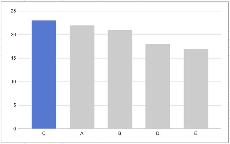
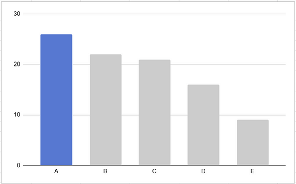
For example, we can use colour to indicate the focus category in this bar chart. Sorting the bars by size helps make the chart easier to navigate too.
We can also use bold text and boxes to indicate what’s important, and what things are related to each other.
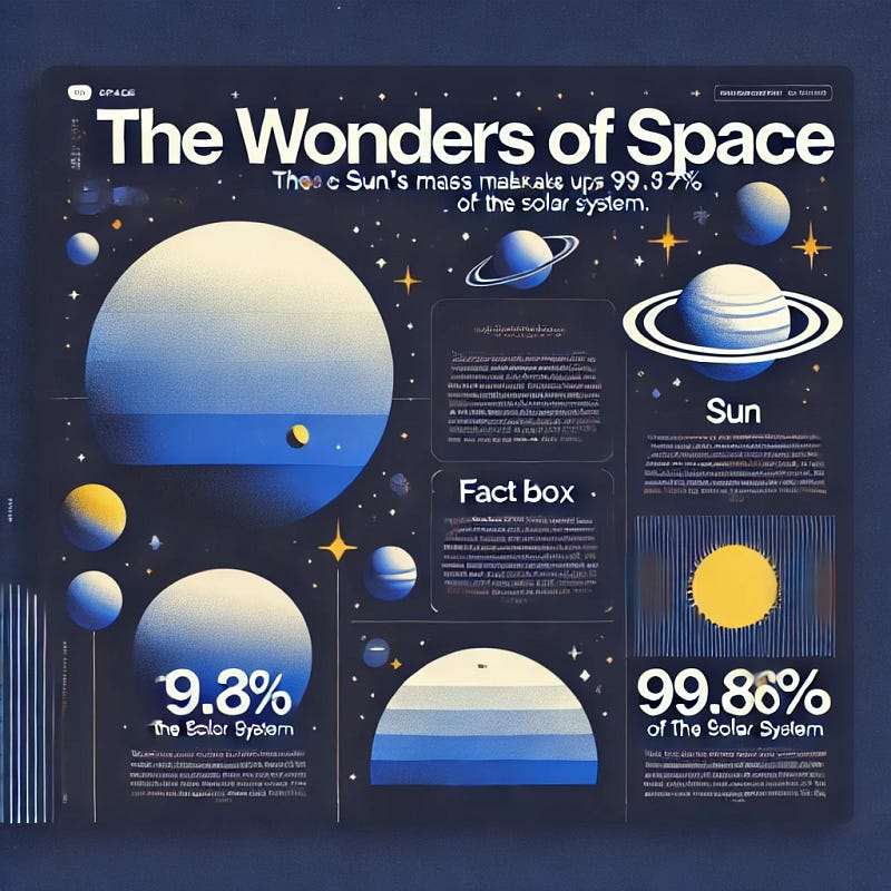
N.B. The above infographic was generated using AI with very little guidance provided, yet still it demonstrates good principles about highlighting important information with bold text and clear sections — even if the text and information is nonsensical.
If ChatGPT can use these principles, then what excuse do we have!
(Remarkably, ChatGPT was correct with the 99.86% of the solar system statistic, although it got it wrong above)
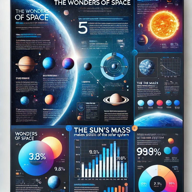
We should also remember that these features can be distracting if overused as our attention is pulled in many different directions at once.
In the example below, it’s difficult to know what order to read in, and it certainly isn’t quick to identify the key takeaways.
Visual Data Encoding
Data can be visually encoded in different ways. Representing figures with visual elements instead of a table of numbers makes it much more digestible.
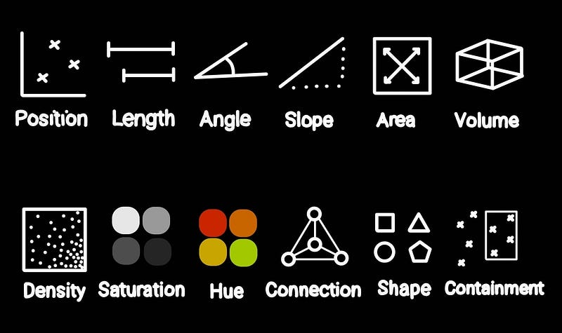
However, different encoding techniques are better suited for different types of data.
Quantitative
Quantitative data consists of numerical measurements, which could include things like size, length, weight, or really any measurable value.
For this type of data, position, length, angle, and area are all quite effective. Whereas, you would have a hard time showing anything meaningful using saturation, density, and shape to represent numerical values.
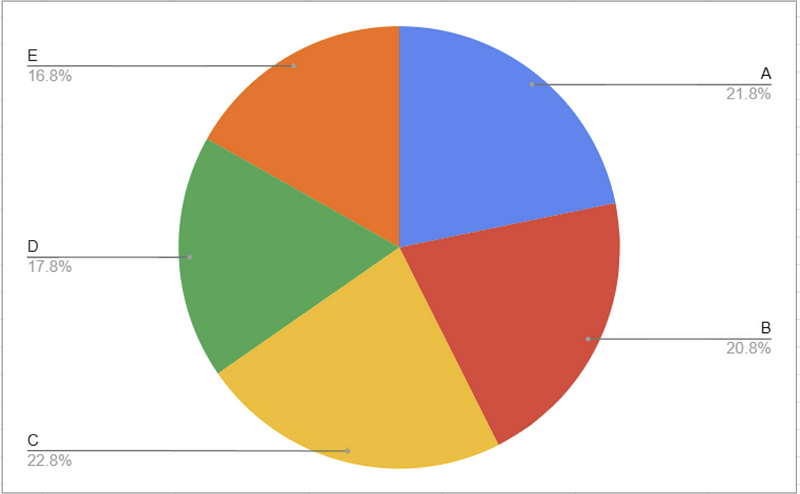
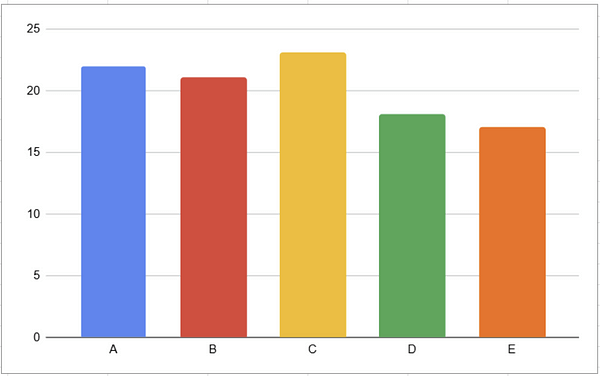
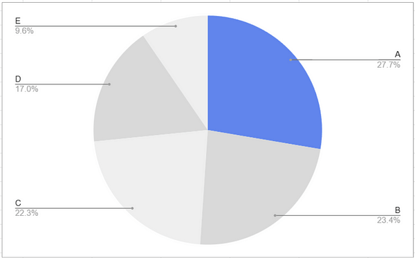
You can probably tell, looking at the pie chart, that yellow ( C ) is the largest category here. But what if we tried to find the second highest, we’d probably have a hard time. On a bar chart, however, it’s immediately obvious which order these categories rank in.
On the other hand, if we asked what proportion of the total is contained in category A, a pie chart, using area to encode the data, would be the better tool for the job.
Data encoding methods are not created equal — if you don’t choose the right one, the data won’t tell the story you had intended
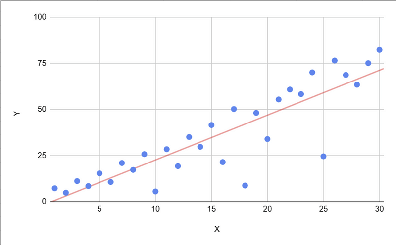
Position is a really effective tool for encoding lots of different types of data. Take a look at this scatter plot…
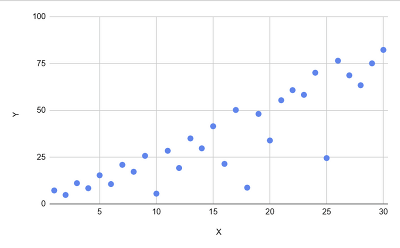
We can see a trend within the data points.
A second method of data encoding (in this case slope) can be used to reinforce this, making the trend more immediately clear, and to indicate that it is the key takeaway from the chart.
Nominal Data
Nominal data refers to named data points. This is most commonly found as labels on charts.
Choosing the right method will determine how easily a reader can understand the relationship between category and label.
Two common methods are connection and hue:
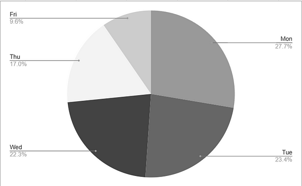
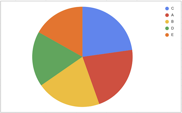
Connection can sometimes be clearer for a reader to understand which category is which, but it can make the diagram quite cluttered when overused.
On the other hand, hue is a powerful tool if you have multiple charts that can make use of the same colour scheme. As the reader progresses through, they develop an intuition of which category is which, just based on the colour.
Ordinal Data
Ordinal data consists of categorical data with a natural order or rank. Here, position, saturation, and hue will be the most effective tools to encode the data.
That said, a pie or bar chart can still be an effective tool for this type of data, we should just incorporate some other encoding method to aid understanding.
Using just shape, area, or volume to represent the data will make it difficult to interpret.
Let’s visualise this data set:
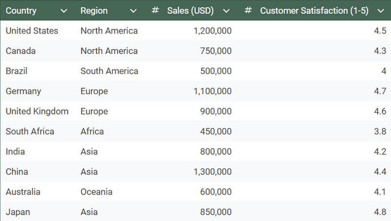
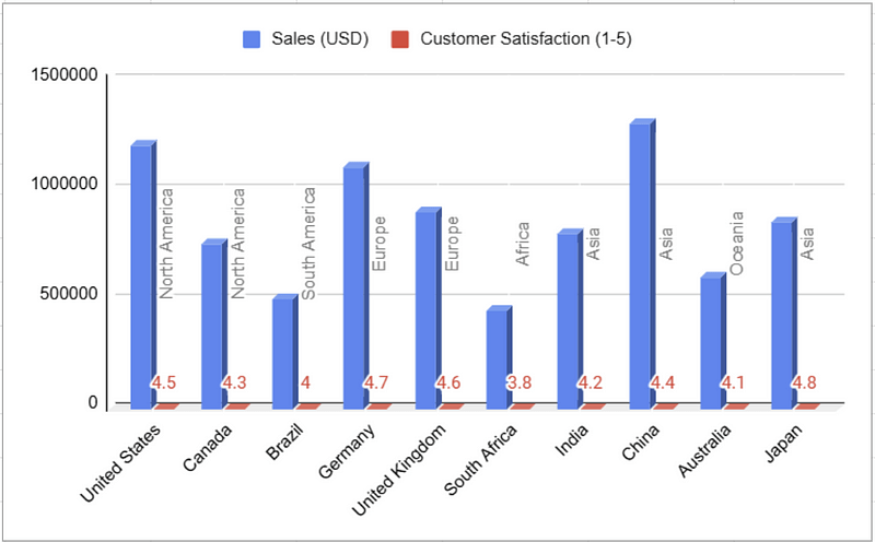
Hopefully, by now, we can see why this bar chart is not a helpful visualisation.
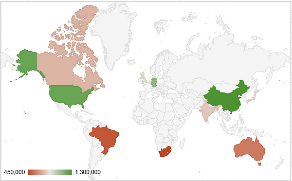
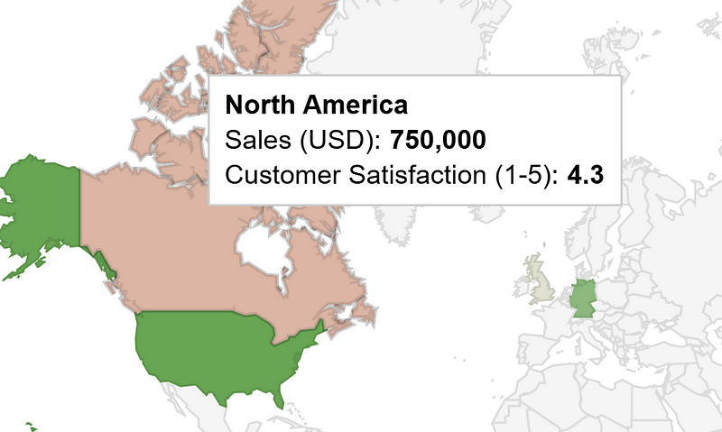
This world map uses a combination of position (country location) and hue to quickly show how countries compare. If we want to see more information about a country, we can hover over it.
This does involve us limiting our visualisation to only one column of the data (sales). If we still wanted to show both, we could do something like this:
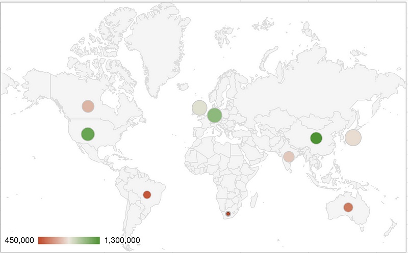
Here we use hue to encode sales, position for country, and size for customer satisfaction rating. Perhaps the size scale is a little misleading as the small dot over South Africa represents a 3.8/5 but with some minor tweaks, we have a chart that manages to provide an intuitive understanding of a complex data set.
Gestalt Theory
Gestalt Theory describes how visual elements are interpreted and understood by the human brain and how relationships between elements are inferred.
We won’t go into the history or background of it here, but if you’re interested, maybe check out this article (unaffiliated).
Gestalt Theory can be summarised by a list of principles. Let’s take a look at some examples:
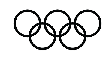
Principle #1. Figure and Ground
As a rule, bold, high-saturation, and dark colours are interpreted as foreground (figure), whereas light, less-saturated features are seen as the background (ground).
This is obvious in the above example; we can tell we’re not looking at a white piece of paper with a ring-shaped cut-out. The dark region is clearly on top of the white one — at least so it appears.
We can use this when designing a chart if there is one group we want to compare to the rest of the population
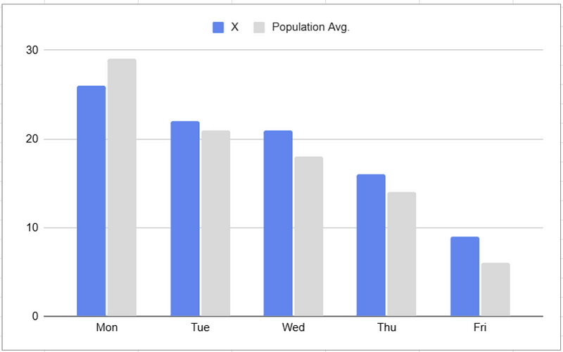
The bold, blue colour stands out and draws attention when compared to the subtle grey bars representing the wider population.
This principle is also present in the gridlines that appear in the background of the chart.
Let’s revisit the Olympic rings for principle 2…
Principle #2. Pragnanz (Simplicity)

In the above example, we interpret the image as 5 interlocking rings.
We could also interpret this logo as a series of squiggly line segments, or even one big looping curvy line.

Principle #2 states that we seek the simplest interpretation of what’s presented to us — in this case rings.
So how can we use this to help us design better charts?
Keep it simple.
Whatever you put in front of a reader, they will probably take it at face value.
There’s no bonus points in trying to be clever — it’ll probably just make it needlessly complicated.
The message we want to convey should be the most easily accessible one, and we want to stick to chart types that a reader is familiar with.
Principle #3. Proximity
The principle of proximity states that objects that are close to each other are perceived as being related or having something in common.
A great example of this is a scatter plot. The human brain is great at identifying clusters and groupings.
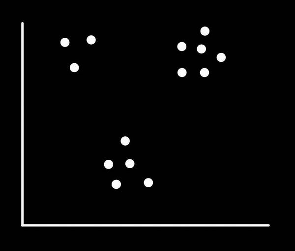
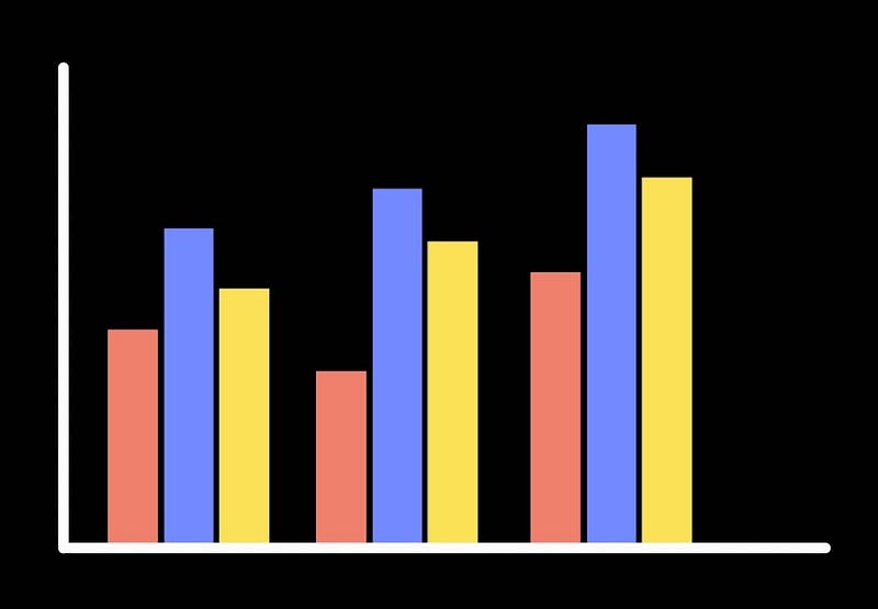
Proximal points and clusters of bars appear to have something in common
For data design, this means we should:
- Arrange titles and headings near their respective charts,
- Use clusters of related bars on a bar chart,
- Use negative space to emphasise the close proximity of other elements.
Principle #4. Common Region
Principle #4. states that objects that are enclosed in the same region are seen as being related to each other.
This is the principle that a pie chart relies on:
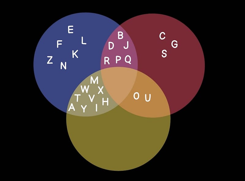
Principles #3 and #4 together are helpful tools for designing the layout of charts and structuring an infographic.
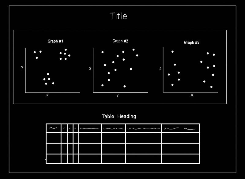
We can use bounding boxes, headings, negative space, and place related things near each other to make our report much easier to navigate.
Principle #5. Similarity
The principle of similarity states that objects that share some property or appear visually similar are perceived as being related.
For data design, this has a few consequences:
- Consistent colour coding to tie categories together,
- Consistent layout between pages — the same components should be in the same place so the reader knows where to find it,
- Consistent use of shapes, line styles, or markers in charts and diagrams to represent the same type of data or category.
This principle also informs the types of chart we should choose to use in the first place:
- The same kind of chart should always be used to display the same type of data throughout,
- Use charts that are similar to existing ones that the reader has likely seen before.
These guidelines improve the chances of a user understanding how your diagrams work.
Conclusion
Designing an effective data presentation isn’t just about aesthetics — clarity and understanding are crucial to success.
With the techniques we’ve discussed, we can design visualisations that convey insights instantly and effortlessly. Every choice matters, when it comes to helping a reader focus on what’s important and making the data’s story accessible to all.
*Unless otherwise stated, all images are by the author.
*AI was used to generate some datasets and graphics for this article.